Wednesday, December 12, 2012

NAPP Projects


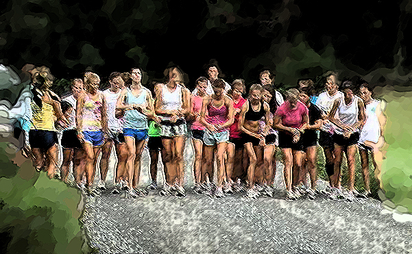
For this project, we were supposed to watch different tutorials on the NAPP website and create 2 projects based on the tutorials we watched. The first video I watched was about the art history brush. It was basically just a touch up on that tool because it isn't really used a lot because not a lot of people know what it is used for. It was very helpful to brush up on the qualities of that tool. I had forgotten how useful it can be. This picture was very easy to do. I used a certain brush to blur out the sides and a different one to make it look kind of sketch like.


For this Project I used a Vortex technique. It was really cool and fun to do. The tutorial I used was really helpful. This project was more involved than the last but it was really cool to learn how to do. 

Monday, December 10, 2012

New Years Card


This project was very simple. We were supposed to make a holiday/new years card for our soldiers over in Afghanistan. This project was very easy and I think it was a good thing to do. Unless they are looking to enlist, kids this age don't really think that much about the sacrifices our soldiers make and what they do for our country.

Wednesday, December 5, 2012

Coca Cola


For this Project we were really focusing on text. So we were required to create an original advertisement. For this ad, I used an old vintage coca cola ad. I changed the color of coke from red to blue and changed the text also. This project was pretty easy, the difficult part was deciding what advertisement to mimic. 

Friday, November 30, 2012

Kaleidoscopes


For this project we were supposed to make a kaleidoscope using a personal image. For this project, I used a picture my friend had taken of my boots. This project turned out okay. The key was to achieve a perfect 45 degree angle and i got 45.03 so it didn't turn out perfect. This project was a bit frustrating because of the angles we had to get in order to make it perfect.


This kaleidoscope wasn't as good as the previous because i got a 45.07 degree angle instead of a perfect 45 degree angle. This project overall was not my favorite. It was a little meticulous in the way that it had to be just perfect or it didn't turn out right.

Monday, November 19, 2012

Photo-Editing Sites

Picmonkey.com
For these next few projects we were assigned to experiment with different "photoshop like" websites. For this image my partner, Hannah Plantz, and I used picmonkey.com. This site was the most interesting to use. It had a lot of different tools but a lot of them haven't been seen in photoshop. It was very different but cool to use.

Splashup.com
For this image, we used splashup.com. This site was cool also. It had a good amount of options to make a really cool and original image. This site wasn't as advanced as picmonkey, but it seemed to be the most similar to the original photoshop with the mechanics it had.

Photo505.com
This website is more just for kicks and giggles more than anything. It has an object or image and you upload a personal photo and it photoshops you personal photo into the picture. The quality of this site isn't very good but it's more for having fun and laughing than creating a serious project.

Picmonkey.com
For this project we used picmonkey.com again. The way we were able to distort this image using the different tools in this program was really neat. Doing this in photoshop would have taken a lot longer and you still might not be able to get an image to look exactly like this.

Taaz.com
This site was very different to the rest. It had to do with make-up. It was actually kind of cool how much you could do with this site. You could completely make someone look different by just doing their make-up and hair. This site would not let us save a picture without  signing up for an account so therefor we do not have a visible project.

Wednesday, November 14, 2012

Inside to Out


This project was called an Inside Out Project. You take a character or an object and show the inside of that thing or person, split in half with the outside. For my project I used Barney Stinson from a very popular TV sitcom "how i met your mother". He is a complete and total player. He uses scams and cons to be with women. So I took the regular cleaned up Barney who always wears a suit as the "outside" and him dressed up as a wingman for halloween to represent one of his cons as the "inside". This project was really cool because I got to incorporate one of my favorite TV shows into a project.

Wednesday, October 24, 2012

Visual Puns

This Project was to make a visual pun. The pun I chose was a serial killer but obviously from this visual, it is a Cereal Killer. I really liked this project. It aloud me to be really creative and kind of silly with the way I interpreted the pun. I really liked this piece in particular because it was really fun to make.
This is another visual pun. This image is a Chocolate Moose. I took a Hersheys bar wrapper and made it the filling of a moose shape and put the image in front of a Hersheys chocolate world. Out of the four visuals I made, this was probably my least favorite because it wasn't as fun as the others to do.
For this visual pun, I made a Horse Fly. This pun was probably the hardest to do because it's really hard to outline the shape of the horse to paste it onto a different background. This project was still pretty fun though. It took the longest time because i tried to be pretty precise with the outlining.
This one, like my first visual, is just silly and fun. This visual pun is a Ruler. This one didn't take very much time but it was really fun to do because there are so many different ways I could have made this image.


Monday, October 22, 2012

Filtered Selfies

This project is called Filtered Self-Portraits. For this assignment, we were supposed to create a 9"x9" grid with nine 3"x3" self portraits. We were supposed to distort and manipulate the images of ourselves. This project can be hard for some people because they don't like the thought of distorting themselves to create "art". I really likes this project. It was very neat and you could do so many things to create a very cool and unique picture. I used a lot of different filters on my portrait. The picture I used is one that was taken when i was in a tournament in italy so there are lots of cool memories that are attached in this piece.

Friday, October 19, 2012

Untitled

This painting does not have a name, it is untitled. It's painted by Milton Resnick. it is an oil painting on canvas. This painting 34 1/4 x 22 1/4 inches. I really like this painting because it's abstract and there are so many ways you could interpret this painting. I love the colors used in the piece. This painting inspires me to be very creative and use lots of colors in my work.

Maison au Bord du Ruisseau

This painting is called Maison au Bord du Ruisseau. It is painted by Henri Martin. It is an oil painting on canvas. It's 32 1/2 x 34 3/4 inches. I really like this painting because it is abstract but it is a lovely picture and you can tell it could be the scenery of a real place. This painting inspires me to put different amounts of detail in my work. Some that look very real, some that look like an actual painting and not exactly like a photograph etc.

Monday, October 8, 2012

Fire Wordle

For this assignment, we were supposed to create a wordle, which is basically a collage of words. With the wordle, we were to make the collage the background of a picture and the outline of the picture was the boarder of the wordle. This project was really cool because you could make it anything. It could be personal, fun, random, or anything. I made mine about fire. I used words like hot, ashes, wood, warmth, dangerous, blight etc.

Friday, September 28, 2012

15 Green Things


This project is called 15 Green Things. The objective of this project is we are given 15 green images and we have to use them to create a unique image. We are not aloud to us any other images besides the ones we are provided and we have to use at least one piece of every image. I used the hands as my main focus and bordered the other images around it to make a frame. Then made the other images a different color. I didn't really like this project that much. I felt very limited with what I could do. This assignment didn't let me get really creative and do something completely different in my opinion. 

Wednesday, September 19, 2012

An Invented Creature

My assignment this week was to create a hybrid animal. For this project, I was supposed to take six different animals and combine them into one animal. I was supposed to have at least six different layers. I used a platypus for the head of this creature. Platypuses are one of my favorite animals. I used a giraffe for the neck, a moose for the top half of the torso and a leopard for the bottom half and the legs. I used a monkey for the tail and a frog for the feet. The frog added a little originality to the piece. I really liked this project because I was able to be really creative.

Monday, September 10, 2012

Music


Our assignment was to make a music poster using different tools and given pictures. To create my final project I tried to be very creative but still make the images used fit with the rest of the poster. I wanted my final project to look like it could be an actual poster from a concert or of an album. This project was the first of many. It was a very cool project to do because you were able to be creative with the process of creating the poster.